Posts Tagged ‘pen and ink’

I’ve had a bit of a run on the sketchbook, there were no other requests pending so it has been a good time to experiment and do some drawings for myself.

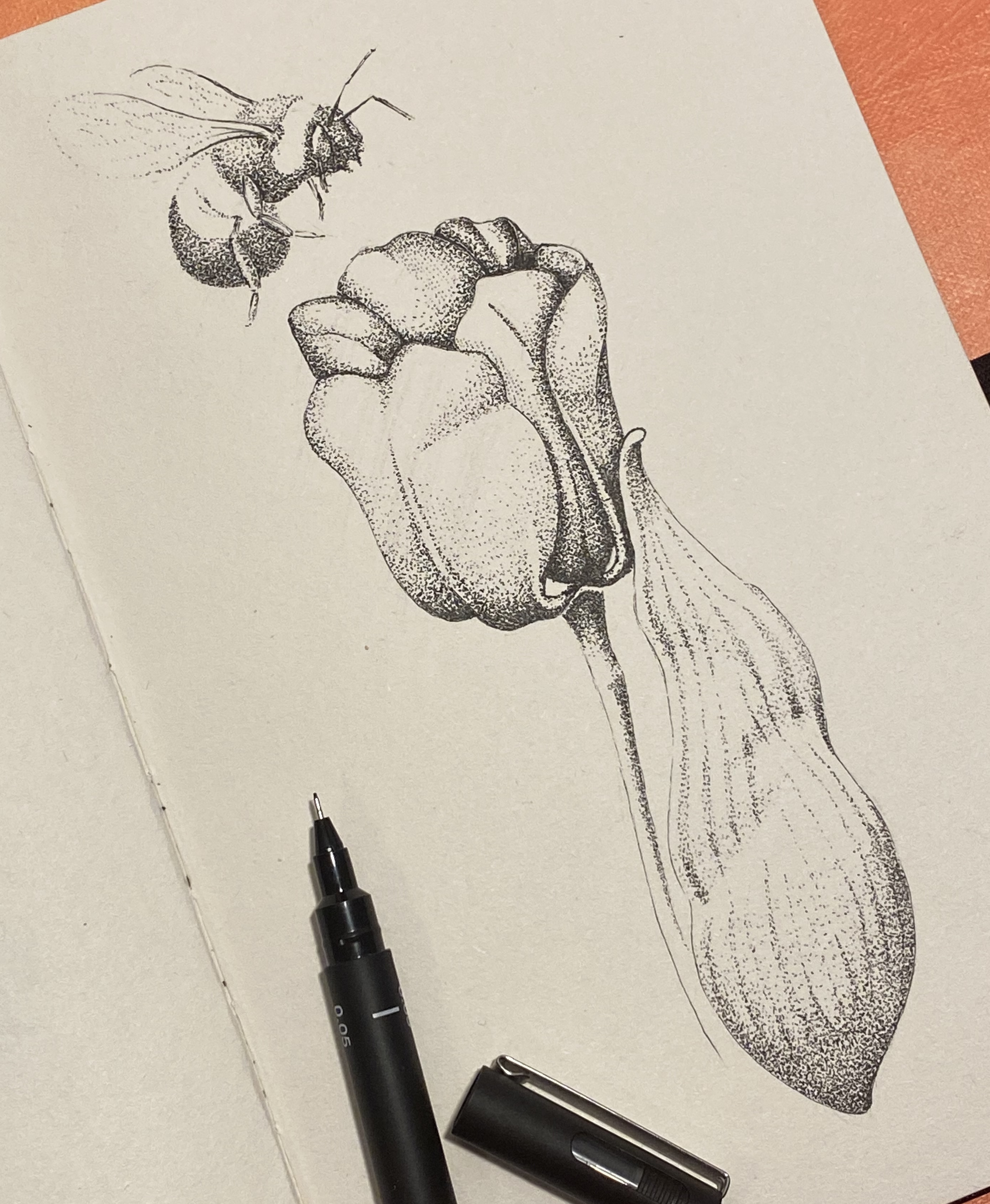
In the last Sketchbooking post I showed the tulip and bee, and the peony. One stippling, one hatching. This time there are another two completely different ideas.

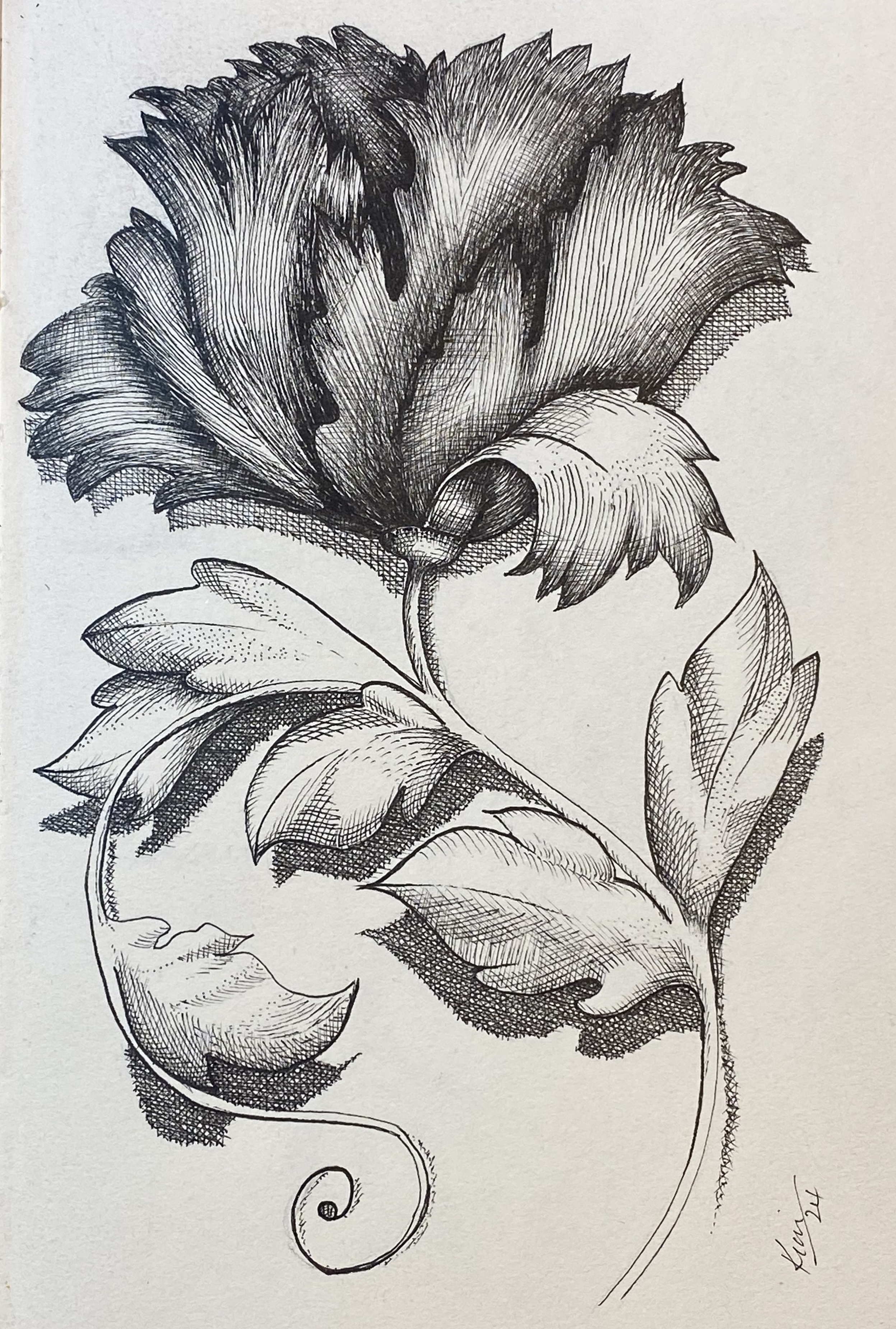
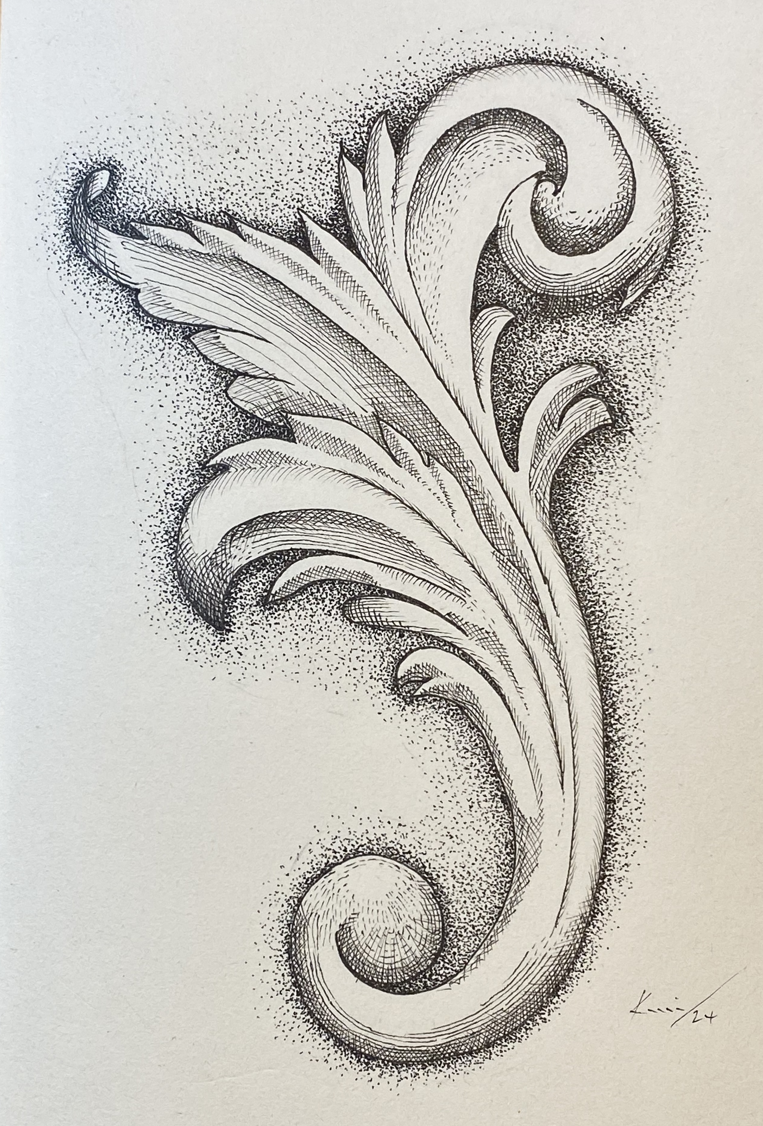
First I tried an architectural scroll, sometimes likened to acanthus leaves, from classical designs. I stippled the background shading, but wanted to try hatching lines for the contours. I wasn’t sure if the two techniques would work together, but I was pleased with the overall effect. What do you think?

The second is a rose. This time I thought the subject needed a softer look, so it was back to stippling all the way. The paper of the sketchbook is not the best quality and consequently the stippling was not as sharp as it could be, so I outlined the rose for better definition.

As the rose was quite life-like I added leaves in as natural looking way as I could. This was an interesting exercise as I was working from memory. Again, I am satisfied with the finished piece – but want to try a similar picture with hatching lines.

I will put away the sketchbook for a while as I have to attend to other projects, but I have enjoyed the experience and found it useful. So these won’t be the last sketches, watch this space.

I’ve been doing ‘stuff’ in my sketchbook! I never really bothered with sketchbooks, I thought of them as a bit of a waste of time, but actually, it has been useful.

I go to a group meeting, the Tuesday Craft Collective, a bunch of arty villagers getting together for tea, biscuits, chat – and someting arty-crafty. All very pleasant and simple. As I usually draw or paint I needed something easy to transport – the sketchbook and a handful of pens and pencils. Ideal!

I started by stippling a tulip, which I coloured with pencils, then I added a bee, just for fun.

Next up, I wanted to try hatching/crosshatching. It is a fascinating technique with a long history, but no longer popular. I drew a peony, and I am pleased with the result.

Using the sketchbook is a way of practising techniques without the pressure of completing a finished piece.

More to come …

This one was a bit of a dotty challenge. I love the look of old oil lamps and we have a few about the cottage, so I thought I’d give it a go. I used various marks for shading, some hatching, some stippling, and I achieved a pleasing result.

The glass was difficult as I needed to make it lighter than the brasswork with the impression of transarency. And the shadows of the glass were interesting.

Let me know what you think.

This view is from the old tennis court, looking up towards the house surrounded by shrubs and trees. Drawn with fine liners and coloured with Polychromos pencils.

The Garden House is near Yelverton, Devon, and its 10 acres of garden is open to the public.

I’ve started a large still life with acrylic on canvas, it consists a metronome, a bottle of pastis, an overturned glass over a blue draped cloth. Trouble is that, like with many projects I get sidetracked with other ideas. This time I wanted to try the picture in pen and use hatching, so I put aside the brushes and paints and got out the pens.

This is the result of the experiment. I didn’t know where the end product would go. I tried to match the hatching with each area in real life. I don’t think it’s too bad considering I usually use stippling for shade.

Things I would do differently include:

The shading on the dark side of the metronome. Next time I would hatch in a direction that would suggest the vertical.
Shading/brightness on the glass need better effect. Must work on that.
Background needs work.

Let me know what you think.

While I was on the course with Paul Clark I didn’t use any pen and ink techniques – I wanted to immerse myself in the watercolours. But when I got home I fired up the Narwhal fountain pen and Carbon black ink.

This old sluice was at the lake in the grounds of the hotel and I grabbed a quick sketch before I left. I’m certainly pleased with the result.

Back to my favourite medium – pen and ink.

The swiss-cheese plant (monstera) in our bathroom decided to get rid of its oldest leaf, but I thought is was too attractive to throw away, so I kept it.

It gradually went browner and more curled, and eventually it was just right for drawing. I tried a couple of ideas but couldn’t resist the good old fine liners. It took a while as there is more detail than you see at first glance.

I was torn between leaving the finished piece black, or whether it should be coloured – so here are both versions. What do you think? Or should I have gone green, may be?

This caricature was commissioned ages ago, but I’ve held on to publishing it as it was intended as a Christmas present. So, with the celebrations over I can now reveal a house in south Wales.

But, a caricature is not just for Christmas! Let me know what you think, and contact me if you want your house to look a bit special.

Written by Kelia-Jane Hannaford*, this is a story of hardship and decisions. It is centred on Devon’s Exmoor near the end of the 18th century.

I was pleased to have been asked to do some of the illustrations for the book, which also contains some of the author’s own photographs:

An aside about Kelia-Jane can be found at: https://scratchypen.wordpress.com/2021/08/20/whatever-happened-to-kelia-jane/

*Kelia-Jane Hannaford is the pen name of Richard J Small, a prolific author with ten other books to his name.

As an artist, when you get a commission you are chuffed (that’s a strange English word for ‘very pleased’). But you don’t always know how well the results have been received.

When you get a repeat commission, you are even more chuffed.

I’m really chuffed to say that one client, Karen Barclay of @karensquilts , has the triple whammy!

From top to bottom; Arthur, The Shed, and The Old Granary. Thank you Karen!